Our Blog
Dig into the candybowl
At 501creative, we love our candybowls! This online candybowl contains updates from 501 that we want to share and information we think our nonprofit friends should know. Next time you’re in the neighborhood, stop by the office for a taste of the edible candybowl!
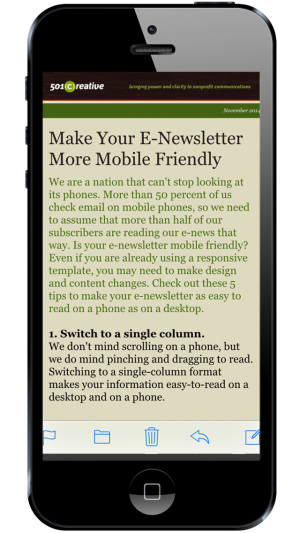
We are a nation that can’t stop looking at our phones. More than 50 percent of us check email on mobile phones, so we need to assume that more than half of our subscribers are reading our e-news that way. Is your e-newsletter mobile friendly? Even if you are already using a responsive template, you may need to make design and content changes. Check out these 5 tips to make your e-newsletter as easy to read on a phone as it is on the desktop.
1. Switch to a single column.
We don’t mind scrolling on a phone, but we do mind pinching and dragging to read. Switching to a single-column format makes your information easy-to-read on a desktop and on a phone.
2. Ease up on the photos.
Photos take time to download on mobile devices and eat up data plans. Ninety-three percent of readers only open an email once, so if your email takes too long to download, it just might get the dreaded delete button. Use one photo, and make it a good one that will pull readers in.
3. Shorten articles and link the rest to your website.
We tend to write our electronic newsletters the same way we do for our print publications. If you are writing in multiple paragraphs, like you would for a print newsletter, that’s probably too much content for an e-newsletter. Create shorter articles with bullet points, or provide the beginning of an article and put the rest on your website. A button instead of a link can make it easier for fingers to find. If your website is responsive, the experience will be seamless for your readers.
4. Publish more often.
Instead of publishing long, comprehensive e-newsletters that cover a variety of topics, consider creating several different ones covering specific topics that readers can subscribe to based on interest. Or limit your e-newsletter to a few topics and send them more often. Don’t be afraid of e-mailing too much. Your audiences will be happy to get news from you if it’s compelling and relevant. Keep your communications short, engaging and mobile-friendly.
5. Keep fonts large and use high contrast colors.
Constant Contact recommends using a minimum size of 11 points for body text (22 points for headlines) with strong contrast. Make sure to test your e-newsletter on phones, desktops and tablets to make sure it is easy to read regardless of the device used.
Remember: clear, concise and easy-to-consume is the way to go with mobile. If your readers find it easy to read on a phone, they are going to love it on a desktop or tablet!
If you want to learn more…
about communicating more clearly on phones or making your website responsive, let us know!